Problem
The company needed a professional online presence that could explain its advisory work without making the content feel heavy or difficult to scan.
Client website
A website for a life science advisory company where the main goal was to make a complex professional field feel calm, credible and easy to understand.
The company needed a professional online presence that could explain its advisory work without making the content feel heavy or difficult to scan.
Life science companies, investors and professional partners who need to understand the company quickly and trust the information.
Web design, frontend and content structure. I focused on layout, hierarchy, navigation and making the content easier to follow.
HTML, CSS, responsive layout work, content hierarchy and visual design decisions.
Process
I started by looking at what a visitor needs first: what the company does, who it helps and why it is credible. That helped shape a clearer page order.
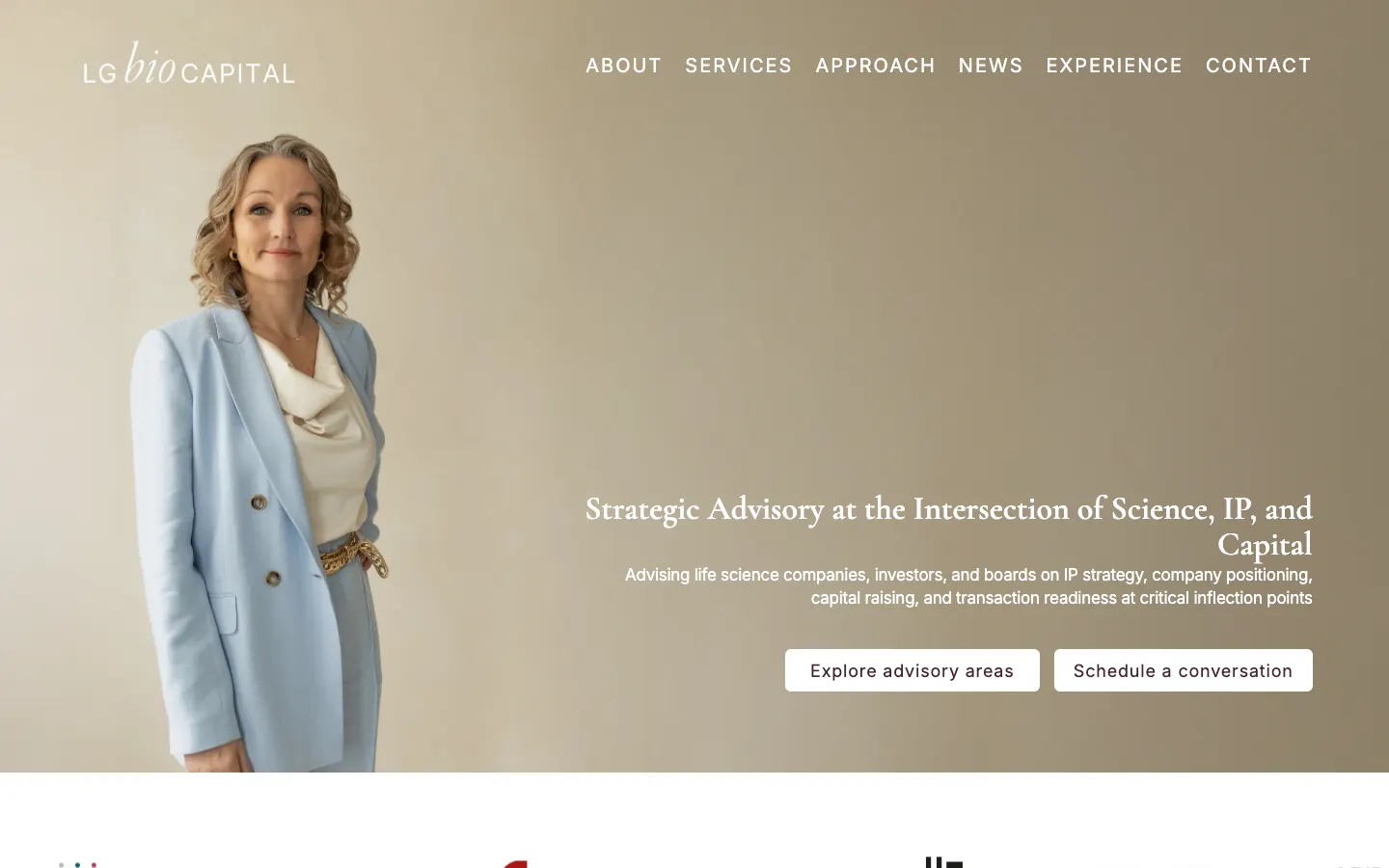
I kept the design calm and professional with generous whitespace, a restrained color direction and a hero section that feels more advisory than promotional.
The layout was built to work across screen sizes, with a strong hero, readable content sections and navigation that stays simple.
Content evidence
The hero establishes strategic advisory as the main offer before introducing detail.
Visitors can scan the advisory areas and the principles behind the work.
Professional activity and experience support the information already presented.
The contact route appears after visitors have enough context to decide whether to reach out.
Evidence boundary: The live site confirms the implemented hierarchy. I have not added conversion claims or client metrics because those have not been measured.
Decisions
I used a calm visual hierarchy because the subject is already complex. The design should support trust and clarity, not compete with the content.
I kept the frontend structure straightforward, so the site is easier to maintain and explain. The focus was on responsive layout and readable sections.
I checked the site visually across screen sizes and adjusted spacing, image handling and hierarchy. A formal usability test would be a useful next step.
Result
The published website presents the company's offer, approach, professional activity and experience in a responsive structure. The project shows that I can work with real client material and turn dense content into a calmer frontend presentation.
What I learned: Content hierarchy matters most when the subject is already complex. The interface needs to reduce effort without making the company sound less substantial.
Next step: I would add more documented testing and before/after notes if I continue developing the case study.