Problem
Emergency information can be difficult to scan and act on when a user is under pressure.
School project
A tsunami emergency guide designed to turn critical information into clear actions before, during and after a warning.
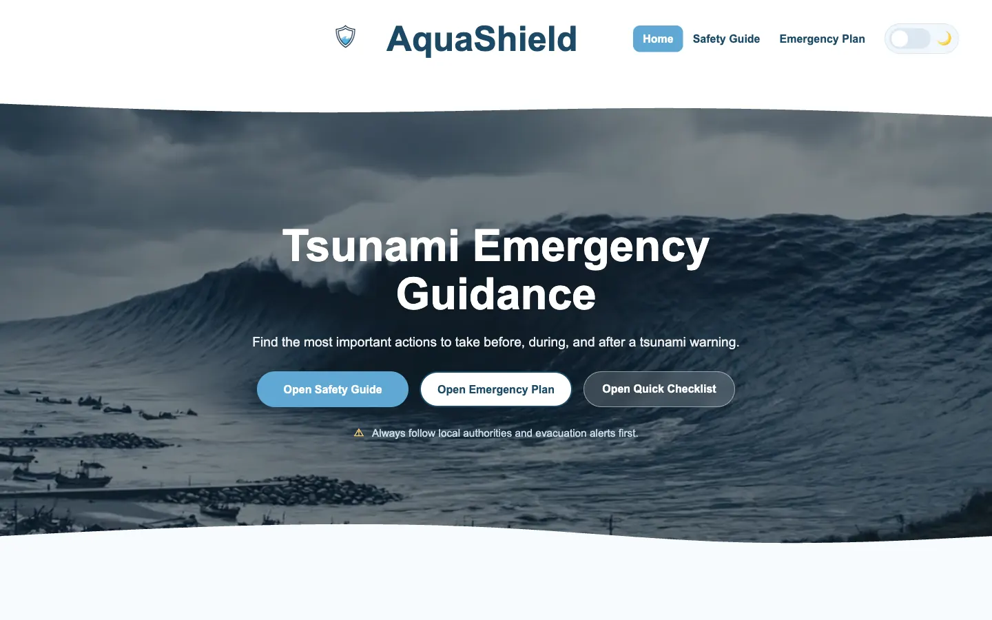
Emergency information can be difficult to scan and act on when a user is under pressure.
Residents or visitors in tsunami-risk areas who need a quick overview and a more detailed personal plan.
Frontend development, interaction design, UX writing, responsive layout and form feedback.
HTML, CSS, vanilla JavaScript, native form validation, dialog elements and responsive testing.
Process
I divided the content into preparation, active warning and recovery so the user can start from the situation they are currently facing.
The interface gives a short overview first and uses accordions, dialogs and the interactive house diagram for information that needs more space.
The personal emergency form lets a user review required contact and evacuation information before showing a saved-plan summary.
Interaction evidence
The opening content explains the purpose and presents the most important safety routes.
The interactive diagram connects situations in a house with relevant safety information.
The checklist and emergency-plan form turn general advice into personal information.
Validation and a dialog summary help the user check the plan before leaving the form.
Evidence boundary: The interactions and validation are implemented in the live project. The content hierarchy has been reviewed responsively, but it has not yet been tested with people in a real emergency context.
Design and code
I kept headings action-oriented and separated required information from optional detail so the page is easier to scan.
I used semantic forms, native validation and the dialog element because the project did not need a framework or a custom component system.
The navigation, cards, diagram and form stack at smaller widths so the main actions remain readable and touch-friendly.
Testing
The form handles empty required fields, invalid values, a complete summary, dialog closing and clearing the saved plan.
I checked the page at mobile and desktop widths and adjusted the navigation, cards and content order where they became crowded.
The next useful step is a task-based test with external users, followed by a review of the accuracy and tone of the emergency content.
Result and reflection
The result is a responsive emergency-information prototype with several interaction types connected to one clear task. It demonstrates UX writing, forms, interface feedback and JavaScript behavior beyond a static layout.
I learned that interaction should reduce uncertainty. A dialog, animation or form state only helps when it makes the next action easier to understand.
Next step: I would run an external usability test and simplify any content that users hesitate over.
Usability testing plan
Status: Planned — external testing has not yet been completed.
Test whether 3–5 adults who have not seen AquaShield before can find relevant guidance, understand the interaction and complete a personal emergency plan in a calm test setting.
Record task completion, critical errors, moderator assistance, hesitation or wrong turns, and participant comments. Observe scanning order, unclear labels and any form fields that cause confusion.
Findings: Pending external sessions. Resulting design changes: Pending analysis of the completed test notes.